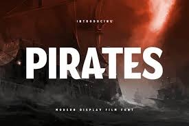
Typography in cinema is more than just a visual element; it’s a storytelling tool that conveys mood, genre, and era. From the iconic “Star Wars” crawl to the elegant “Harry Potter” lettering, movie fonts shape our perception of films before the first scene even begins. This article delves into the significance of movie fonts, highlighting notable examples and exploring how TypeType’s collection offers versatile options for designers and filmmakers.
The Power of Typography in Film
Fonts in movies are carefully chosen to reflect the essence of the story. They set the tone, hint at the genre, and immerse the audience in the film’s world. For instance:
- Star Wars: The “Star Jedi” font, inspired by the original “Star Wars” title, evokes a sense of adventure and the vastness of space.
- Harry Potter: The “Lumos” font captures the magical and mysterious atmosphere of the wizarding world.
These fonts are more than just text; they are integral to the film’s identity and audience perception.
TypeType’s Movie Font Collection
TypeType offers a curated selection of fonts designed to meet the diverse needs of movie and video production. Their collection includes both classic and contemporary styles, ensuring that designers have access to versatile and high-quality typefaces.
TT Norms® Pro
A bestseller from TypeType, TT Norms® Pro is a geometric sans-serif font known for its clean lines and modern appeal. Its versatility makes it suitable for various cinematic applications, from titles to credits.
TT Fors
Inspired by mid-20th-century geometric sans-serifs, TT Fors offers refined proportions and a neutral personality. It’s ideal for projects seeking a balance between classic and contemporary design elements.
TT Hoves Pro
This Scandinavian sans-serif combines neutral characteristics with a lack of visual contrast, making it perfect for modern film titles and credits that require a subtle yet impactful presence.
TT Neoris
An elegant Neo-Grotesque font, TT Neoris encompasses modern requirements and user desires. Its refined design makes it suitable for high-end cinematic branding and promotional materials.
TT Supermolot Neue
Exuding a futuristic feel, TT Supermolot Neue is an advanced, modular sans-serif with squared forms and chopped angles, ideal for science fiction and action film titles.
Choosing the Right Font for Your Film
Selecting the appropriate font is crucial in conveying the desired message and atmosphere. Consider the following when choosing a movie font:
- Genre: Different genres often have associated fonts. For example, horror films might use sharp, angular fonts to evoke fear, while romantic comedies might opt for softer, script-like fonts.
- Era: Fonts can also indicate the time period of the film. Vintage fonts can transport the audience to a different era, enhancing the storytelling.
- Mood: The font’s style can set the emotional tone. Bold fonts can convey strength and action, while delicate fonts can suggest elegance and grace.
Conclusion
Typography plays a pivotal role in the cinematic experience, influencing how audiences perceive and connect with a film. TypeType’s diverse collection of movie fonts offers designers a wealth of options to enhance their projects. By understanding the power of fonts and selecting the right one, filmmakers can ensure that their titles and credits resonate with the intended audience.
READ MORE : Que es Food Service Descubre Todo Sobre el Servicio de Alimentos


